Does it have a cookie banner? Check. A Datenschutzerklärung? Check. An Impressum? Check. Sometimes, using a German website feels as though those were the most carefully considered questions in the entire project. The legal notices are there, the login works, and the buttons eventually get you somewhere. But somewhere between meeting the requirements and shipping the product, another question seems to have been forgotten: what is the experience like for the person using it?
That is the frustration behind a pattern I keep encountering in German digital services. Functionality becomes the finish line. If a system works and people continue using it, there seems to be little reason to question the experience around it.
I believe that sets the bar too low.
The person behind the click
I studied computer science with education. As part of that, I studied educational psychology and sociology from an educational perspective, rather than through the lens of software engineering. Those studies still shape how I build software. They encourage me to consider how people learn, interpret information, develop habits, and operate within different social environments.
People bring all of that with them when they open an application. Yet some interfaces feel as though the person is expected to adapt entirely to the system: learn its terminology, memorise its navigation, work out what the button means. Once you have figured everything out, the product becomes "easy to use", at least for someone who has already learned its rules.
That leaves an important question unanswered: how much unnecessary effort did learning those rules require?
Three apps, one city
I live in Regensburg, and three apps on my phone show this pattern in different ways.
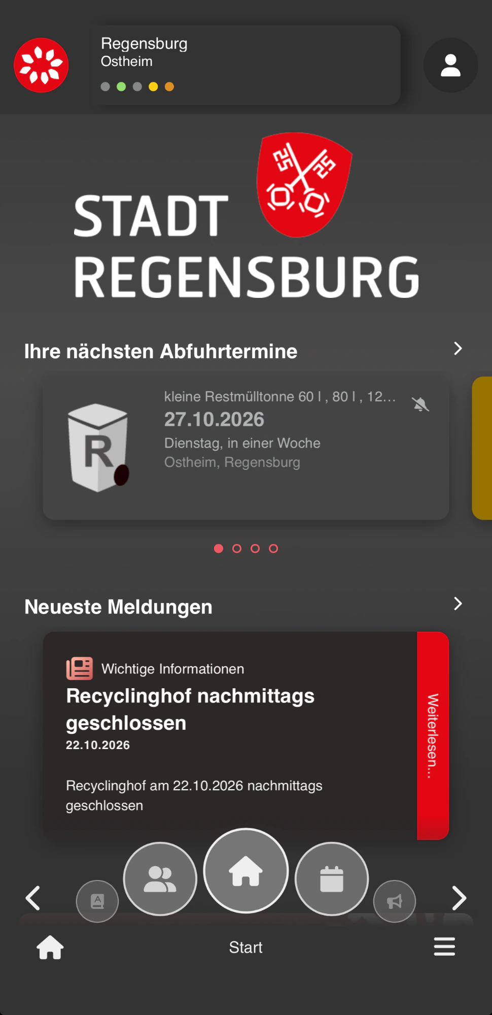
The Abfall-App: useful, but only in German
The Abfall-App carries the Stadt Regensburg branding and does valuable things. It tells me when my bins are collected and when the recycling centre closes early. But Regensburg is a university town with international students, workers, and residents, and the app is available only in German. A newcomer has to understand "Restmülltonne" before the app can tell them which bin goes out on Tuesday. The city's logo also fills the top third of the home screen, while the information people open the app for sits below it.
Translation tools such as DeepL and modern AI models make multilingual content far more achievable than it used to be. It still takes care: navigation, notices, and error messages all need to stay accurate. But the starting question is simple: who needs this service, and what language would help them use it?
Das Telefonbuch: new glass, same screen
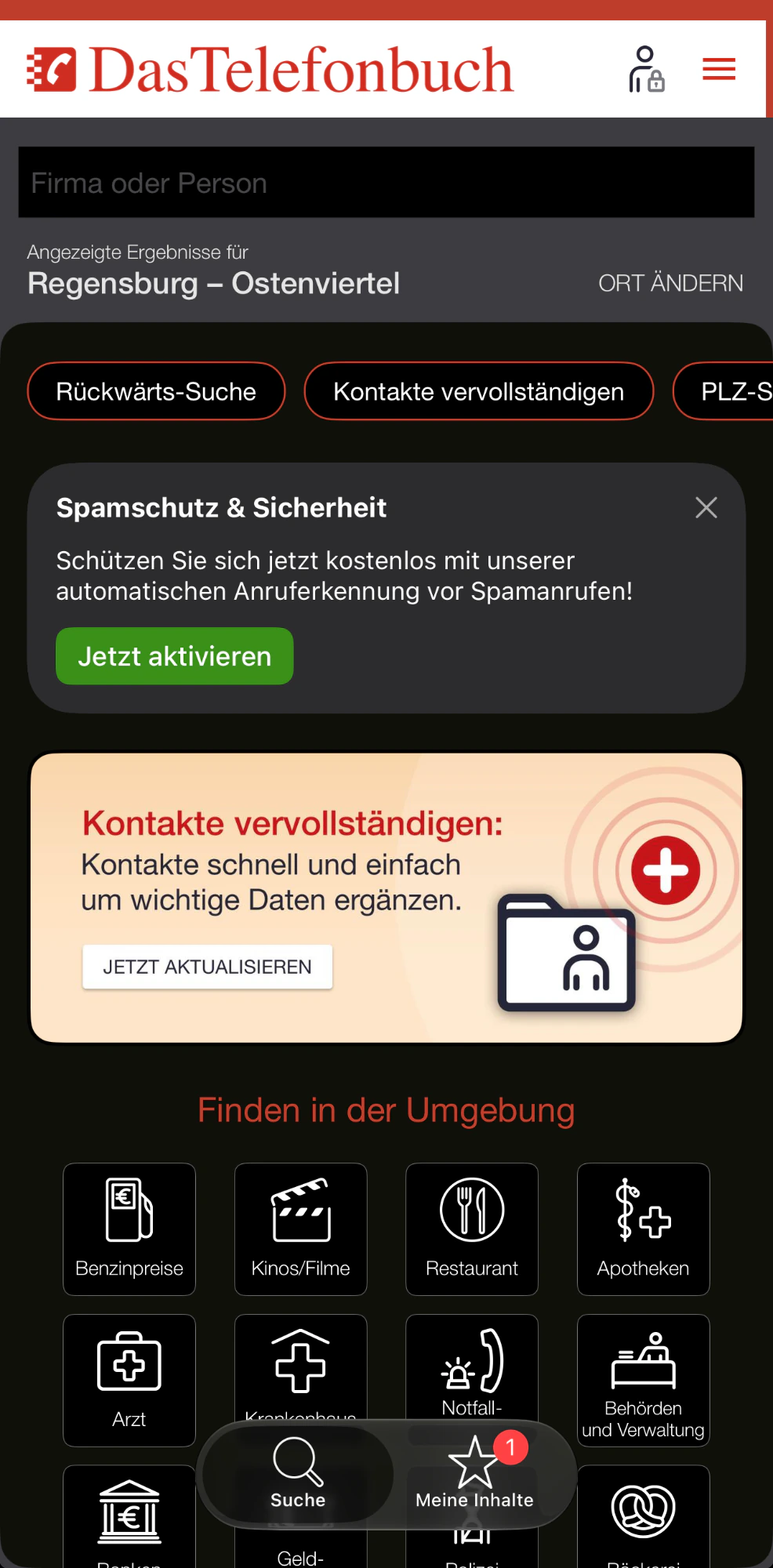
Das Telefonbuch recently adopted the glass look, and the floating tab bar is fine. Content scrolls beneath it, so nothing is lost. The problem is everything else, which has not changed.
The app’s name sits in the header of an app I have already opened, taking space from what I came to do. Red is the brand colour, and it is used almost everywhere: the top strip, the wordmark, the menu icon, the outlines on the shortcut buttons, the heading above the category tiles, the promotional card, and a notification badge. When everything is red, nothing stands out, and a screen that is mostly red starts to look like a screen full of errors.
A brand colour works best as an accent, used sparingly to point at the one thing that matters. Here that could be the search field, with the rest kept neutral. The new glass layer did not touch any of this. The screen looks newer, but it feels the same.
Regensburg: a toolbar from another era
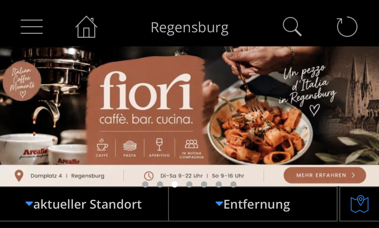
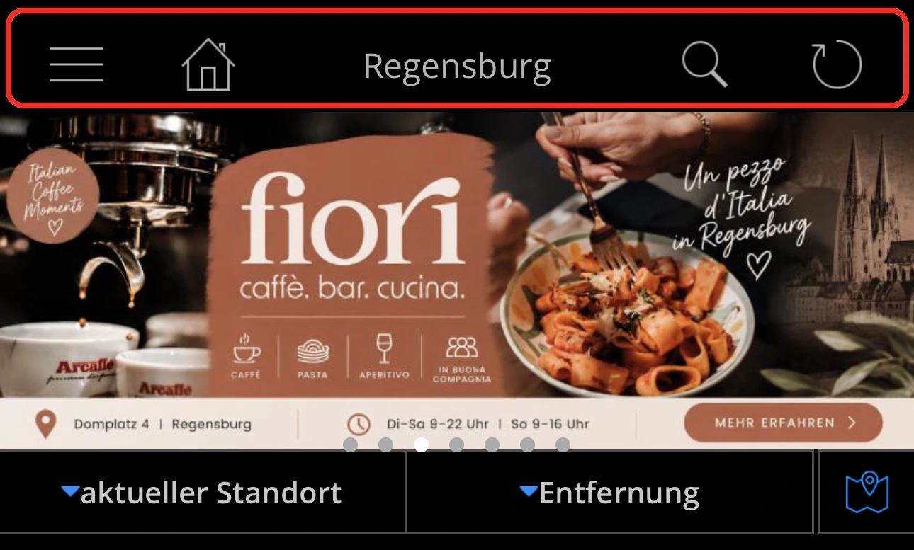
The third app is simply called Regensburg, and its top bar holds a menu, a home icon, the app's name, a search icon, and a refresh icon. Almost every part of that bar can be rethought:
- Home belongs at the bottom. That is where thumbs and habits expect it.
- The app's name doesn't need to be inside the app. I already know where I am, because I just opened it.
- Search should be a visible field, not an icon. Today it takes two extra steps before I can type a single letter. Removing the home icon and the title frees room for a permanent search bar at the top.
- Refresh doesn't need a button. Pull to refresh has been standard for years, so that icon can go.
Below the bar, a rotating banner and a row of filters come before the first listing. A cleaner version would be a search field, content, and a bottom bar with home.
"Modernised" is not the same as "improved"
Operating systems regularly revisit how their interfaces look and behave, because expectations and devices change. There are good reasons to preserve familiar interfaces: existing users depend on them, and a product should not change just because a new trend has arrived.
Still, familiarity should not become an excuse to stop improving. We can modernise the infrastructure while keeping navigation that makes a simple task harder than it needs to be. And we can add a fashionable glass effect to a mobile application without touching any of the problems users actually have.
Visual polish has value, but it cannot carry the whole experience.
Five questions before you ship
- Can people find what they came for without scrolling past promotions?
- Would a newcomer understand it in their own language?
- Is the most common action (usually search) one tap away?
- Does anything new, like a floating bar or a banner, cover existing content?
- Can people recover from a mistake?
"It works" should begin the conversation
My criticism is not that every German application is poorly designed. It is that I keep encountering an attitude in which basic functionality appears to be enough.
Legal compliance matters. Reliability matters. So does the experience of the person trying to get something done. A functioning login and a clickable button cannot answer all those questions, and neither can revenue alone.
"It works" is a starting point. We should expect more from the experience that follows.
- User Experience
- Design
- Accessibility
Written by Isaac Hatilima
I build and run products across web, mobile and infrastructure.